7 Common Colour Mistakes People Make While Painting Their Home – And How to Avoid Them
Choosing the right paint colour can transform your space beautifully, but a wrong decision can spoil the entire look. Most homeowners unknowingly commit some common mistakes during colour selection. Here are 7 major colour mistakes and practical tips on how to avoid them.
1. Ignoring Lighting Effects
A colour may look perfect on a shade card but completely different on your wall.
- Natural and artificial lighting change colour appearance.
- A shade can look bright during the day but dull at night.
✔ Always test the colour on your wall in morning, afternoon, evening & night light before finalising.
Taking advice from a professional painter or designer can help you avoid disappointment later.
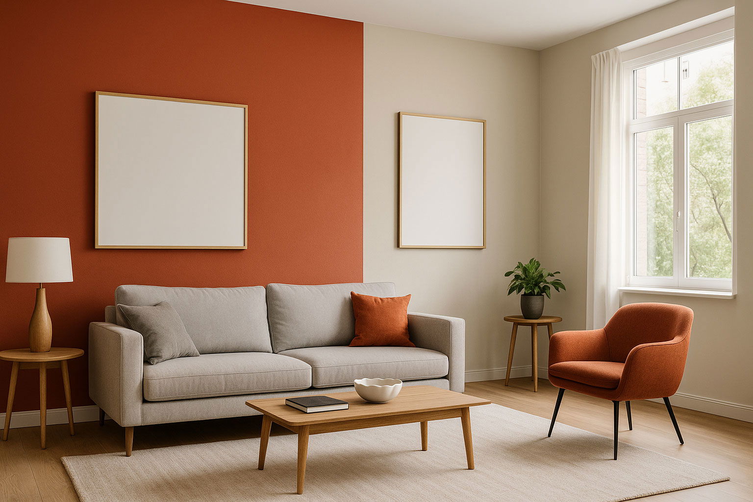
2. Using Too Many Colours in One Room
Adding multiple shades may seem creative, but:
- It makes the room appear cluttered and visually stressful
- Overuse of colours reduces space perception
✔ Stick to 1–2 primary colours and use additional colours only as subtle accents.
3. Not Experimenting at All
Being overly safe with colours can make your interiors look dull or outdated.
✔ Don’t hesitate to experiment with creative accent walls, décor accessories or contrast elements.
The key is balance – the accent should enhance the room, not overpower it.
4. Not Leaving “Visual Breathing Space”
Too many patterns, textures and bold colours can exhaust the eyes.
✔ Always keep some walls or sections neutral (white, beige, grey).
This helps the vibrant elements stand out and creates visual calmness.
5. Playing Too Safe
Sometimes, people choose very common shades to avoid risk – resulting in a flat or uninteresting outcome.
✔ Consider adding a bold feature wall, contrast trim, or modern shade that reflects your personality.
6. Choosing the Wrong Finish
Even the right colour can look wrong if the finish is unsuitable.
- Glossy paints highlight imperfections
- Matte may look dull where mild shine is required
✔ Use high-gloss for highlighting (doors & trims), satin or semi-gloss for living areas, and matte for ceilings or calm spaces.
7. Not Defining the Room’s Purpose or Mood
Each room should reflect how you want to feel while being there.
- Calm & cosy? Use soft neutrals or pastels
- Energetic? Go for warm tones
- Luxury & depth? Try rich darker shades
✔ Before choosing a colour, define the mood (relaxing, vibrant, classic, minimal, etc.).
Final Thoughts
Selecting colours is not just a decorative task – it’s about setting the emotional tone of your home. If you avoid the above mistakes, you’ll not only achieve beautiful interiors but also create spaces that feel right.👉 Need expert guidance for colour selection, paint type, finish or complete painting services?
Contact ApnaPainter.in – our team helps you choose the best shades and delivers flawless painting with professional execution.